Category: Uncategorized
-
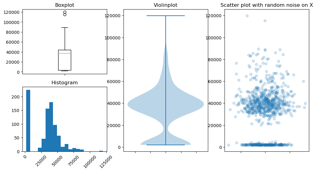
Histograms are the best way to visualize distribution of data points
Data distribution plots help visualize how quantitative data points are spread over the range of their values. Distribution of quantitative data can be shown in various ways such as box-plots, violin-plots, histograms, and scatter-plot with artificially introduced deviations to depicts density of the data points. However, I think the relatively simple looking histogram is the…
-
Convert class labels to categories using keras
Class labels can be converted to OneHot encoded array using keras.utils.to_categorical.The resultant array has number of rows equal to the number of samples, and number of columns equal to the number of classes. Let’s take an example of an arrray containing labels.First we need to import numpy to create the labels array and then define the labels array. The labels contain four…